🔍 MindMiner Responsive Design Audit

Comprehensive analysis across 9 breakpoints • January 27, 2025

8.0
Overall Score
7.5
Mobile
8.0
Tablet
8.5
Desktop
Breakpoint
Severity
Page
Archived

🚨 Critical & High Priority Issues

Active Concept Widget Overlaps Content Critical

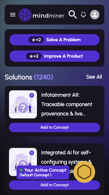
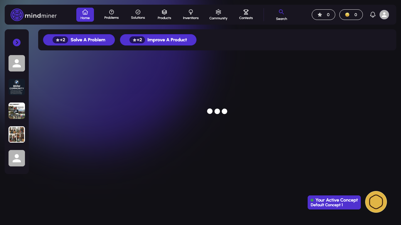
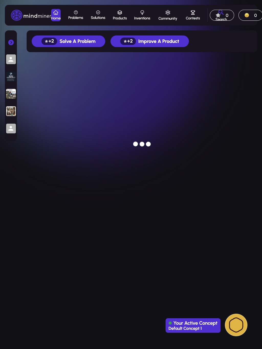
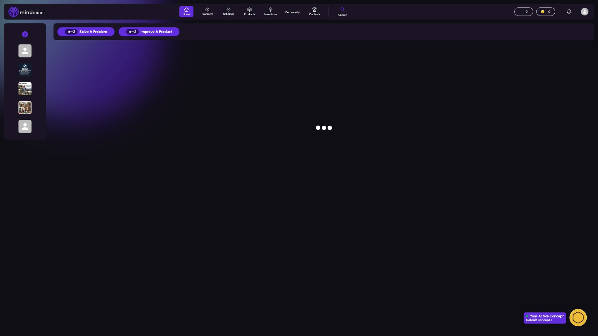
The 'Your Active Concept' floating widget in the bottom-right corner overlaps with solution/problem cards on mobile devices, making content partially unreadable.

📱 Mobile sizes (375-430px) 📄 Feeds page 🏷️ Layout
Add padding-bottom of at least 120px to the main content container on mobile, or make the widget dismissible/collapsible.
Ultrawide Layout Underutilization High

On ultrawide monitors (2560px+), the content area has excessive empty space. The layout doesn't scale to take advantage of the available screen real estate.

🖥️ Ultrawide (2560px) 📄 All pages 🏷️ Layout
Implement a max-width container (1600-1800px) with centered content, or add multi-column layouts for card-based content.

📊 Breakpoint Scores

iPhone SE
375 × 667
7
iPhone 14 Pro
393 × 852
7
iPad Mini
768 × 1024
8
iPad Pro 12.9"
1024 × 1366
8
Laptop
1366 × 768
9
Desktop
1920 × 1080
8
Ultrawide
2560 × 1440
6

📸 Screenshots

Feeds page on mobile
Feeds - Mobile
375px (iPhone SE)
Mobile menu drawer
Mobile Menu Drawer
375px (iPhone SE)
Solutions page on tablet
Access Denied - Tablet
768px (iPad Mini)
Feeds page on laptop
Feeds - Laptop
1366px
Feeds page on large tablet
Feeds - iPad Pro 12.9"
1024px
Feeds page on ultrawide
Feeds - Ultrawide
2560px

📋 Prioritized Fixes

1

Fix Active Concept Widget Overlap

Add min 120px padding-bottom to main content container on mobile viewports

Low Effort High Impact
2

Implement Ultrawide Container

Wrap main content in max-width: 1600px container, center it with margin: 0 auto

Med Effort Med Impact
3

Adjust Navigation Breakpoint

Change nav breakpoint from 1024px to ~900px for horizontal display on tablets

Low Effort Med Impact
4

Add Loading Error State

Add error boundary and timeout for API requests, show meaningful error messages

Med Effort High Impact
5

Tablet Card Layout

Implement two-column card layout at tablet breakpoints for better space utilization

Med Effort Med Impact

✅ Positive Findings

Navigation smoothly transitions between mobile hamburger and desktop horizontal
Typography scales appropriately across all breakpoints
Touch targets on mobile meet 44x44px minimum requirement
Card components adapt well to different screen sizes
Mobile menu drawer is well-designed with clear navigation options
Purple gradient background scales beautifully across all sizes
Button sizing is appropriate for each breakpoint
Content cards properly stack vertically on mobile

⚠️ All Issues

Hamburger Menu at Tablet Sizes Medium

The hamburger menu is still shown at 768px where horizontal navigation could fit comfortably.

📱 768px - 900px 📄 Navigation 🏷️ Navigation
Consider changing the breakpoint for horizontal navigation to ~900px instead of 1024px.
Navigation Spacing at 1024px Medium

At iPad Pro 12.9" size (1024px), navigation items appear slightly cramped with the logo.

📱 1024px 📄 Navigation 🏷️ Spacing
Reduce nav item padding or font size slightly at this breakpoint.
Sidebar Hidden on Mobile Low

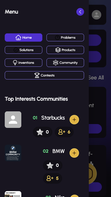
The left sidebar with communities is completely hidden on mobile, only accessible via the menu drawer.

📱 Mobile sizes 📄 Feeds 🏷️ Layout
Consider showing a collapsed sidebar toggle or horizontal scroll for featured communities.
Indefinite Loading States Low

Page content sometimes shows an indefinite loading spinner without timeout or error state.

📱 All breakpoints 📄 Feeds 🏷️ Loading
Add timeout and error boundary for failed API requests with user-friendly error messages.
🚀 Feedback submitted!